Small Business Marketing
Web Design for Dental Practices
New patients check two things before they ever call your front desk: does this office take my insurance, and can I book without playing phone tag. We design dental sites that answer both in one click.
What our clients say
Trusted by small businesses


How does a dental practice website turn searchers into scheduled patients?
By clearing the three hurdles every new patient checks in order: insurance accepted, appointment available this week, and an office that looks like somewhere they’d sit calmly. Put the insurance list one click from the homepage, booking on every page, and real photos of your actual operatories, and the site fills chairs instead of voicemail.
Your insurance page outworks your homepage, so stop hiding it
Watch how people actually choose a dentist and the pattern is almost boring: they search, open three practice sites, and hunt for their insurance carrier. Not your philosophy of care, not the doctor’s bio. The carrier list. On most dental sites that list is buried three menus deep, written as a vague “we accept most major plans,” or missing entirely, and every one of those versions sends the patient back to the search results.
We design the insurance answer into the first screen: a visible link, a scannable carrier list, and a plain sentence about what happens if a plan isn’t listed. Pair it with “accepting new patients” stated outright, because plenty of practices around you technically aren’t, and patients have learned to check. There’s a reason the insurance page usually sits right behind the homepage in a practice’s analytics: it’s where the decision actually happens, so it deserves design attention instead of an afterthought’s formatting.
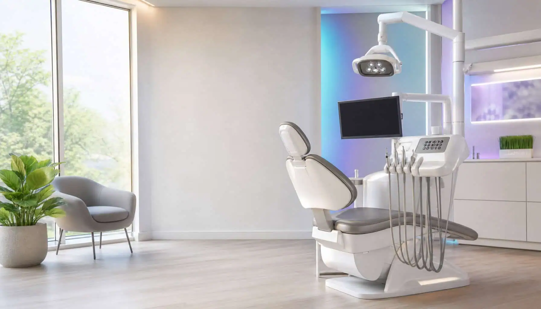
The second hurdle is the calendar. A working online booking path converts the parent scrolling at 10pm after the school nurse’s note, and it protects the campaigns you may already be running. Dental marketing dies at an unanswered phone more than anywhere else we work, and the website is the one receptionist that never puts anyone on hold. The warm photography matters too: people carry real fear into this decision, and an office that looks like your actual office, your chairs, your light, your team, lowers it in a way stock smiles never have.
The hygiene patient and the implant patient need different pages
A dental site has two funnels with almost nothing in common, and designing one path for both wastes the more valuable of the two.
| New family patient | Cosmetic or implant consult | |
|---|---|---|
| What they searched | “Dentist near me taking new patients” | Implants, veneers or aligners by name |
| Deciding factor | Insurance, location, this-week availability | Results, credentials, financing path |
| Right landing page | Homepage with booking up front | A dedicated treatment page with its own consult form |
| Time to decide | Minutes | Weeks, sometimes months |
The cosmetic pages earn their own design care because one accepted implant case can equal a year of hygiene visits from a family. Those pages get treatment explanations in calm, medical-grade language, before-and-after context, financing stated plainly, and a consult request that doesn’t route through the general appointment flow. The patient weighing a major investment in their own face should never land on a generic contact form. These long deciders also return to the page several times before acting, so we design cosmetic pages to reward the second and third visit: answers organized by question rather than by procedure code, a doctor introduction specific to that treatment, and a consult offer that stays visible without nagging. When they finally book, it will be on the page they kept coming back to, and it should be yours.
Details we build into every practice site, chairside manner included
A website earns trust with small courtesies, the same way a good office does. These come standard in our dental builds:
- Online booking that respects your schedule rules, synced or forwarded to the front desk the way your office actually runs.
- The insurance and new-patient answer reachable from any page in one tap.
- New-patient forms downloadable or fillable ahead of the visit, which shortens check-in and signals a practice that values time.
- Photography direction for your team: operatories, faces and the front door patients will look for when parking.
- Your Google reviews streamed beside every booking prompt, since story-rich patient reviews are the referral engine now.
- Separate consult paths for implants, veneers and aligners, each with its own follow-up.
Visibility is the other half of filling chairs: the rankings work lives on SEO for dental practices, paid patient flow on Google Ads for dental practices, and the complete growth system at dentist marketing. We build the site first because every one of those channels lands on it. If you’d like an honest read on where your current site loses patients, book a free discovery call.
The BAO Method
A proven, transparent process, not a black box.
1. Discover
A free call to understand your goals, market and what’s holding growth back.
2. Plan
A custom plan: the exact channels you need, scoped to your budget.
3. Build & Launch
We build and launch it for you: site, campaigns and systems.
4. Grow & Report
We optimize monthly and report on the metric that matters: leads.
Why work with Business All In One
All-in-one
One partner for every channel, no juggling vendors or finger-pointing.
Done-for-you
You run your business; we run the marketing, end to end.
Industry-proven
Real results since 2017 across the trades and local services.
No lock-in
Clear scope, transparent monthly reporting, month-to-month.
Frequently asked questions
Can online booking work with our practice management software?
In most cases, yes. We integrate with common dental schedulers, and where a direct sync isn’t possible, requests route to your front desk with everything needed to confirm in one call. The patient experience stays instant either way.
We’re out-of-network for several plans. What should the site say?
Say it plainly and explain what that means for the patient: you file claims, estimates come before treatment, and financing exists. Practices that explain out-of-network honestly keep patients that vague wording scares away.
Is it worth a page for every treatment we offer?
Build pages where decisions get made: implants, veneers, aligners, emergency visits and new-patient exams. Routine services can share well-organized pages. Depth on the money treatments beats thin coverage of all forty codes.
How do we handle before-and-after photos properly?
With written patient consent and honest, unretouched images, following the advertising rules your state board publishes. We design the galleries; your office owns the consent workflow. Done right, they’re the strongest asset a cosmetic page has.
Will the site help with recall, or only new patients?
Both. The same booking infrastructure makes rebooking lapsed patients nearly effortless, and pairing the site with reminder campaigns reactivates the chart base you already own, usually the cheapest production a practice can add. A patient who skipped two cleanings rarely needs convincing; they need a link that books the visit in under a minute, and that’s exactly what the site provides.
Related
Every practice site we launch is checked against Core Web Vitals and Google’s page experience guidance before it goes live.
Ready to grow?
Book a free, no-pressure discovery call. We’ll map the right plan for your business in about 20 minutes.